How To Change the World
April 6, 2026
Killer Concept
April 6, 2026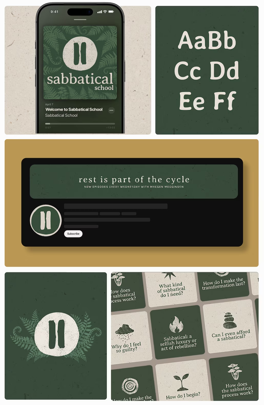
Sabbatical School
Reframing rest as a natural part of a productive life.
INDUSTRY
Career Coaching
DURATION
Nov - Dec 2025
Sabbatical School helps solopreneurs prepare for extended periods of rest without sacrificing their business, income, or sense of identity.
The podcast's core mission was reframing rest as an essential part of the growth cycle. So the main design challenge became to translate that philosophy into a visual identity that felt distinctive, credible, and emotionally resonant.
For an audience accustomed to constant growth and optimisation, a sabbatical can feel irresponsible, risky, or even impossible. The identity therefore needed to balance enough structure to build trust, and enough warmth to make transformation feel safe.
Furthermore, market research revealed that many brands in the same space leaned towards either corporate, minimalistic languages or highly spiritual aesthetics that felt disconnected from the realities of running a business. This revealed an opportunity to create something more balanced: a brand that felt both grounded and slightly radical.
The strategy centred on finding a symbol that could communicate the concept clearly while supporting the emotional needs of the audience. The pause icon emerged as the strongest candidate, due to its simple, recognisable connection to the idea of rest.
But while the pause symbol communicated the concept instantly, it also risked feeling cold, digital, and overly functional. So the focus shifted on balancing it with a richer visual language capable of carrying the warmth, humanity, and sense of renewal at the heart of Sabbatical School.
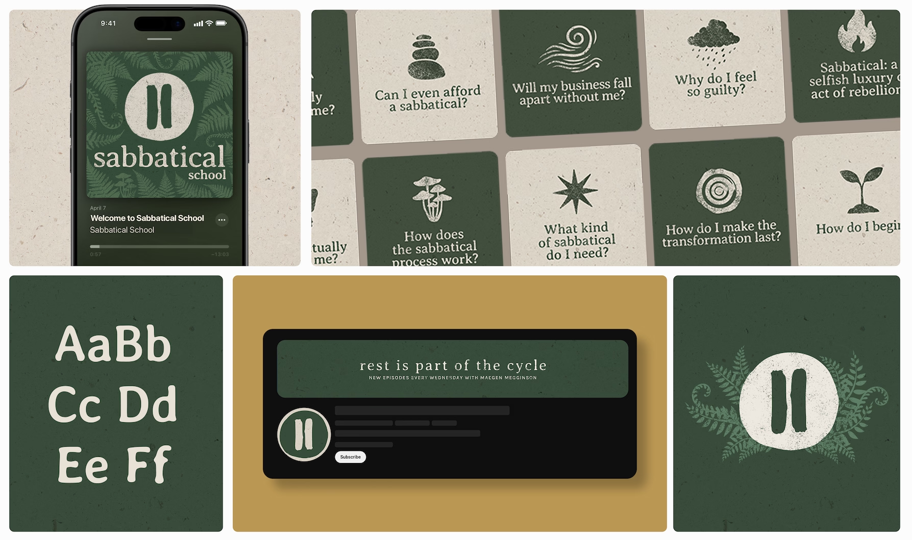
Inspired by natural cycles, seasonal growth, and imperfect textures, the identity balances clarity with character, inviting the viewer into a world that feels calm, grounded, and restorative. The podcast episode thumbnails provide a clear and consistent structure, while the colour palette alternates between light and dark shades, echoing the rhythms of day and night and creating a sense of movement throughout the audience's experience.
Slightly imperfect typography, tactile textures, and organic forms add warmth and humanity, preventing the identity from feeling overly polished or corporate and reinforcing its connection to renewal, reflection, and sustainable growth.
The final identity gave Sabbatical School a clear visual language capable of expressing a complex idea with simplicity and consistency.
Across the podcast, programme materials, sales pages, and future offerings, the system creates a cohesive experience that reflects the programme's core belief: that meaningful growth happens through cycles of activity, reflection, and renewal.
Most importantly, it helped make the idea of a sabbatical feel less intimidating and more approachable, turning an abstract philosophy into something people can immediately recognise and connect with.









Challenge
Sabbatical School helps solopreneurs prepare for extended periods of rest without sacrificing their business, income, or sense of identity.
The podcast core mission was reframing rest as an essential part of the growth cycle. So the main design challenge became to translate that philosophy into a visual identity that felt distinctive, credible, and emotionally resonant.
Discovery
For an audience accustomed to constant growth and optimisation, a sabbatical can feel irresponsible, risky, or even impossible. The identity therefore needed to balance enough structure to build trust, and enough warmth to make transformation feel safe.
Furthermore, market research revealed that many brands in the same space leaned towards either corporate, minimalistic languages or highly spiritual aesthetics, that felt disconnected from the realities of running a business. This revealed an opportunity to create something more balanced: a brand that felt both grounded and slightly radical.
Strategy
The strategy centred on finding a symbol that could communicate the concept clearly while supporting the emotional needs of the audience. The pause icon emerged as the strongest candidate, due to its simple, recognisable connection to the idea of rest.
But while the pause symbol communicated the concept instantly, it also risked feeling cold, digital, and overly functional. So the focus shifted on balancing with a richer visual language capable of carrying the warmth, humanity, and sense of renewal at the heart of Sabbatical School.
Podcast Identity
Inspired by natural cycles, seasonal growth, and imperfect textures, the identity balances clarity with character, inviting the viewer into a world that feels calm, grounded, and restorative.
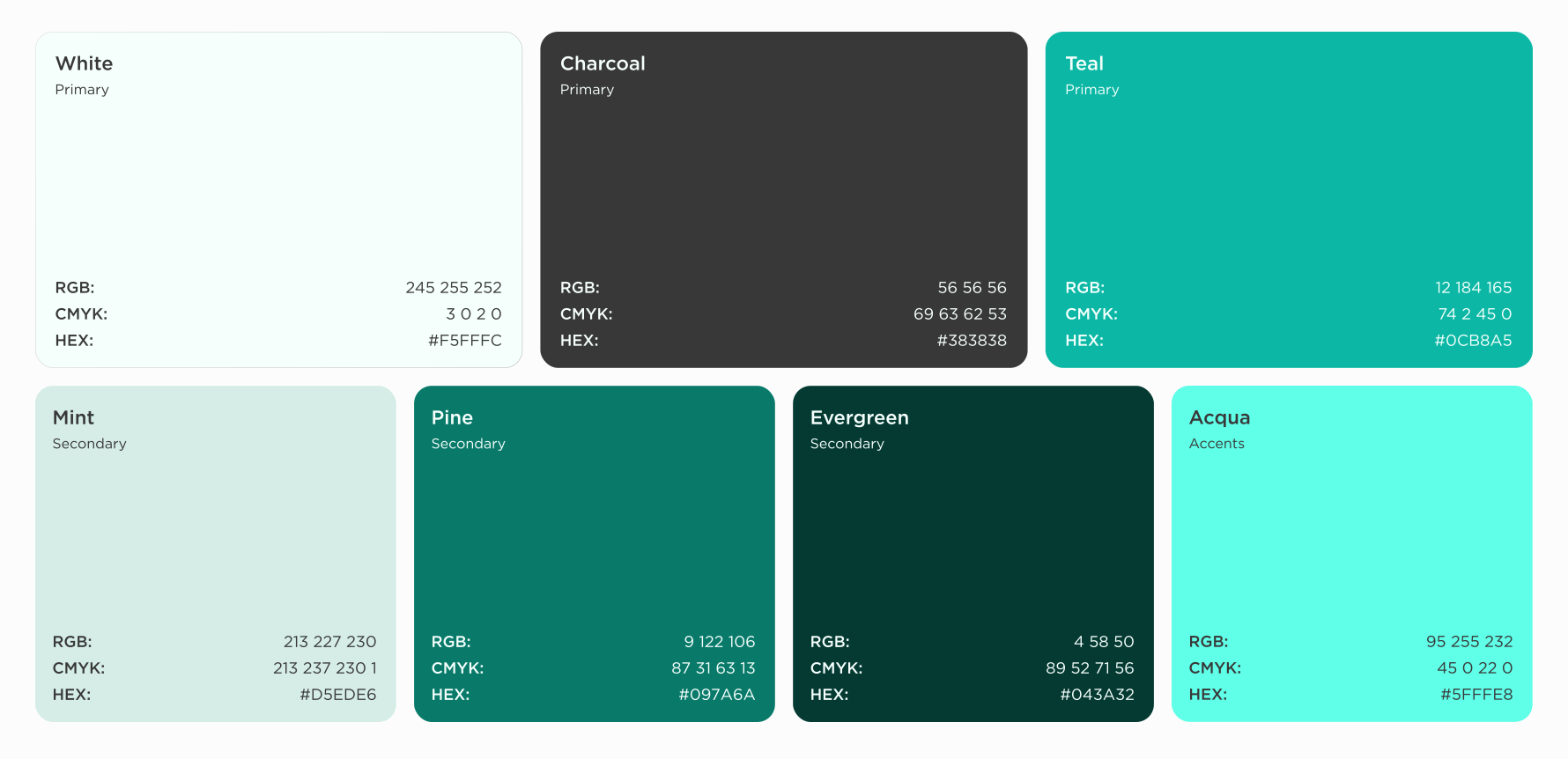
The podcast episode thumbnails provide a clear and consistent structure, while the colour palette alternates between light and dark shades, echoing the rhythms of day and night and creating a sense of movement throughout the audience's experience.
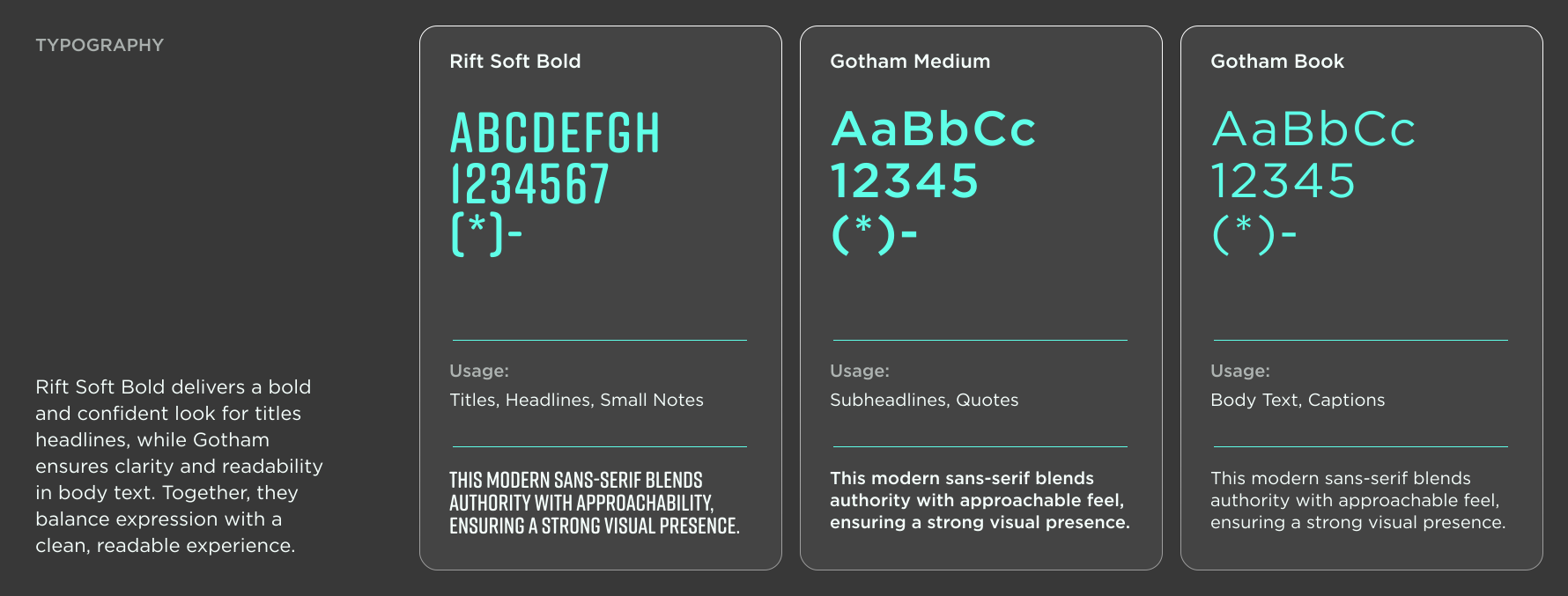
Slightly imperfect typography, tactile textures, and organic forms add warmth and humanity, preventing the identity from feeling overly polished or corporate and reinforcing its connection to renewal, reflection, and sustainable growth.
Outcome
The final identity gave Sabbatical School a clear visual language capable of expressing a complex idea with simplicity and consistency.
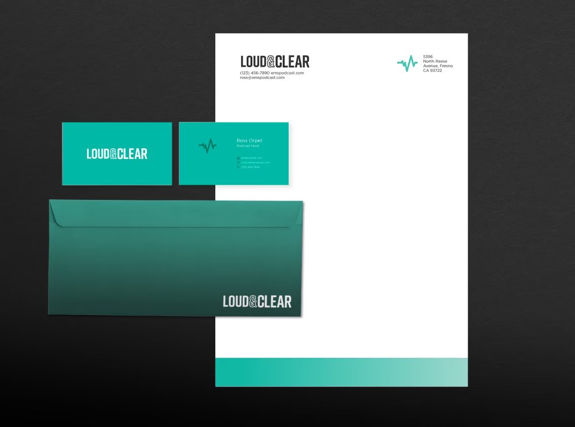
Across the podcast, programme materials, sales pages, and future offerings, the system creates a cohesive experience that reflects the programme's core belief: that meaningful growth happens through cycles of activity, reflection, and renewal.
Most importantly, it helped make the idea of a sabbatical feel less intimidating and more approachable, turning an abstract philosophy into something people can immediately recognise and connect with.
"Francisca helped me understand my positioning more deeply and brought so much creativity to the process."
— Maegan Megginson, Professional Coach & Host of Deeply Rested Podcast
Related Case Studies
- Client
- Ross Orpet & Will Berry
- Website
- View website
Creating a striking animated cover artwork, for a critique based show with a daring personality.- Client
- Ross Orpet & Will Berry
- Website
- View website
Redesigning the artwork for a podcast encouraging interfaith dialogue and community.- Client
- Ross Orpet & Will Berry
- Website
- View website
Positioning a history of technology podcast, for modern curious minds, into a cornerstone of system thinkings.