Ask Dr. Mia
April 6, 2026

Loud & Clear

Repositioning an EMS Podcast into a category-leading educational platform for paramedics

Strategy Brand Identity Website Design Wordpress Development
INDUSTRY

EMS Education

DURATION

2024–2025

>

Challenge

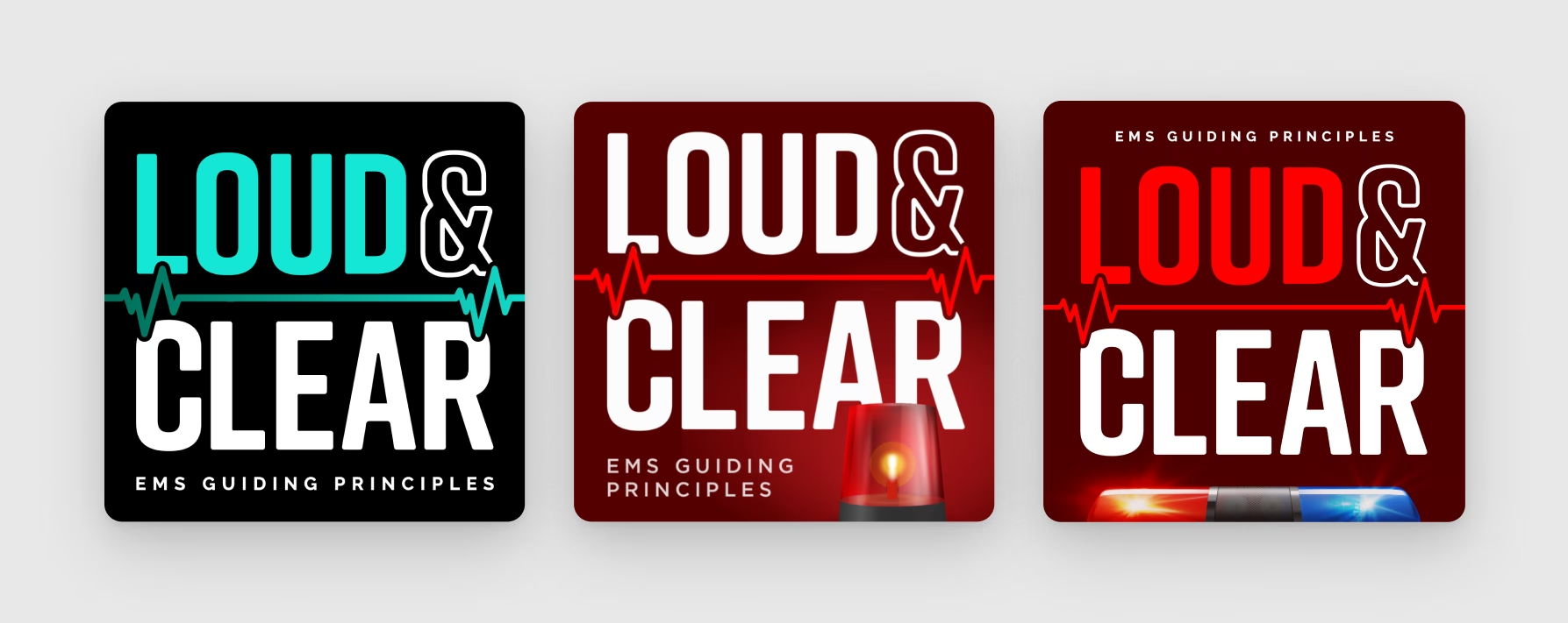
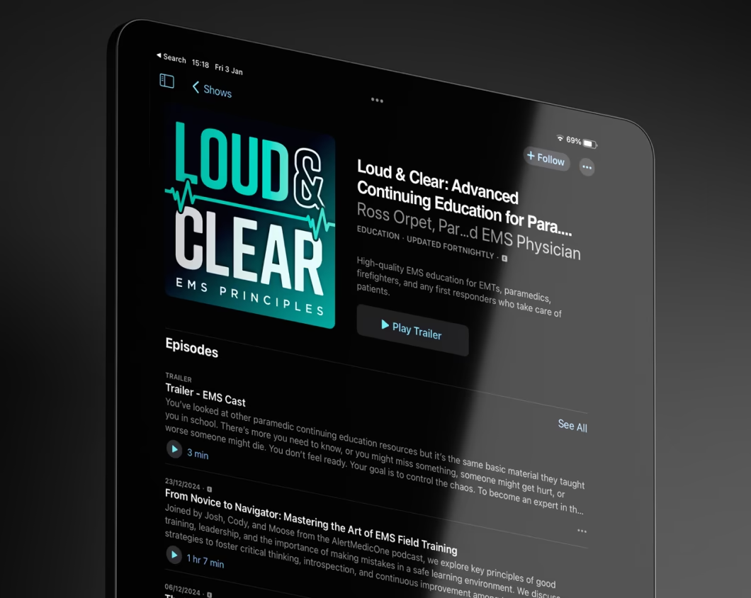
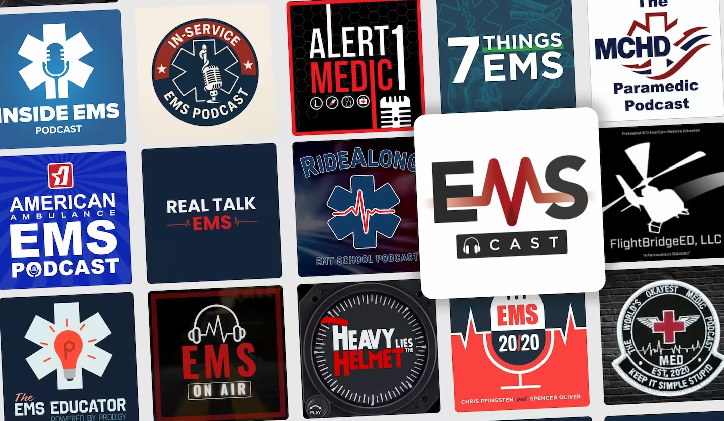
As Ross Orpet and Will Berry renamed their podcast from EMS Cast to Loud & Clear, they wanted an identity that reflected the quality of the education they were delivering. While the existing artwork clearly signalled EMS, it felt dated and visually interchangeable with countless other podcasts in the category.

The challenge wasn't recognition—it was differentiation. How could the brand remain credible to paramedics while creating a more distinctive and memorable position within the industry? 

Discovery

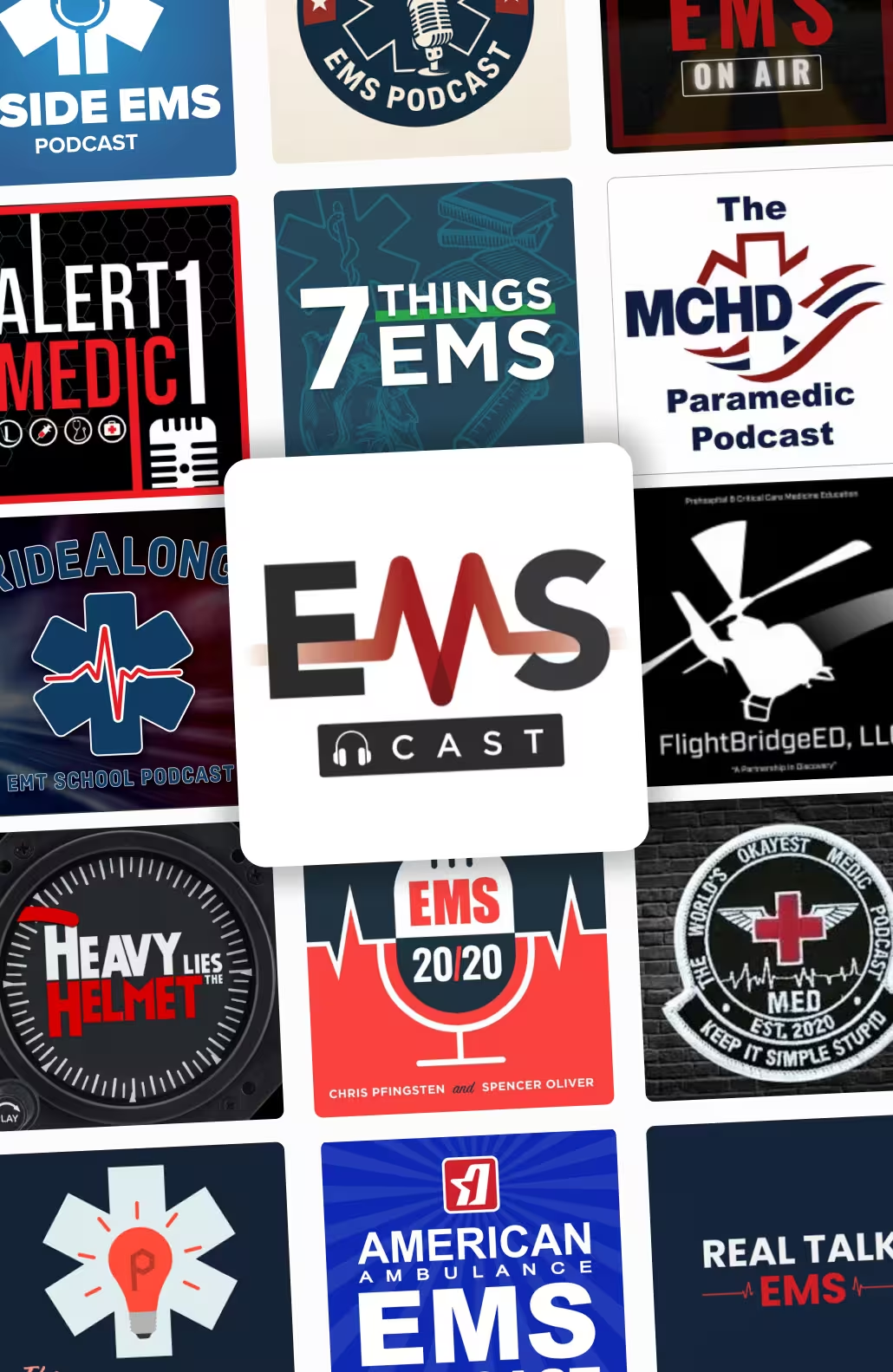
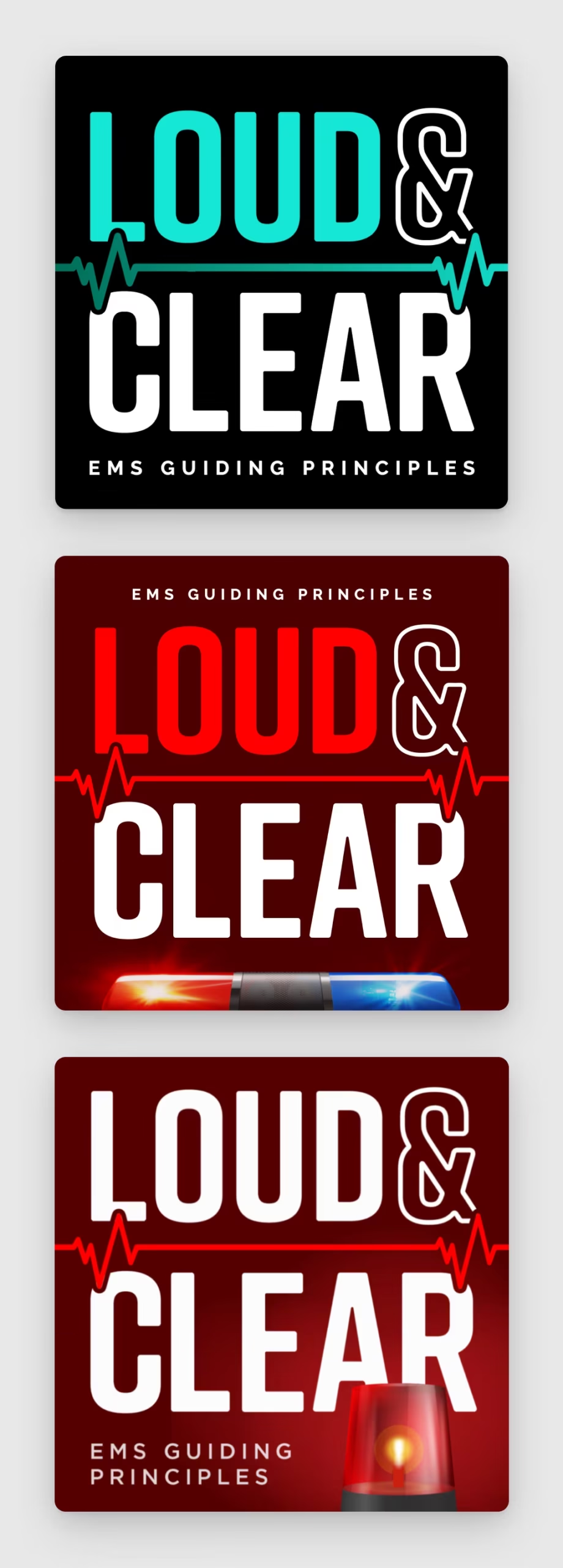
A review of competing EMS podcasts revealed a category dominated by the same visual language: red and blue palettes, ambulance lights, lifeline graphics, and clinical aesthetics. While these cues made the category instantly recognisable, they offered little differentiation.

At the same time, Loud & Clear served experienced professionals seeking practical knowledge and continuous improvement, creating a clear mismatch between the sophistication of the content and the way it was being presented.

Strategy

Discovery workshops and competitor analysis revealed an opportunity to move beyond conventional EMS branding. Rather than leaning further into medical symbolism, the brand could own a space centred around clarity, confidence, and professional growth.

The goal became creating an educational platform that felt calm, authoritative, and supportive — helping professionals navigate high-pressure environments while continuously improving their skills.

Brand

The identity system was designed to stand apart from category conventions without losing relevance to its audience.

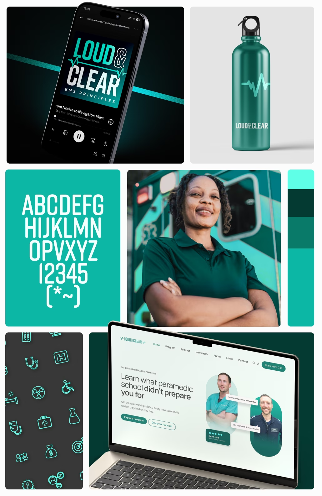
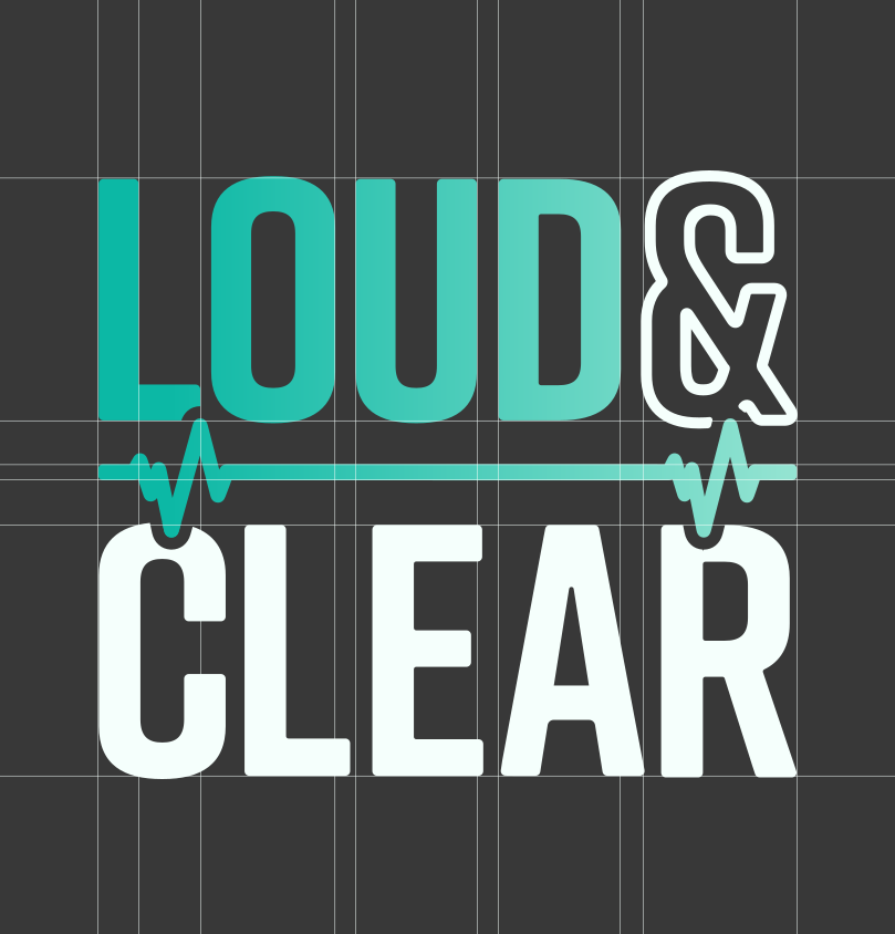
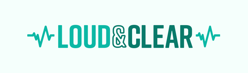
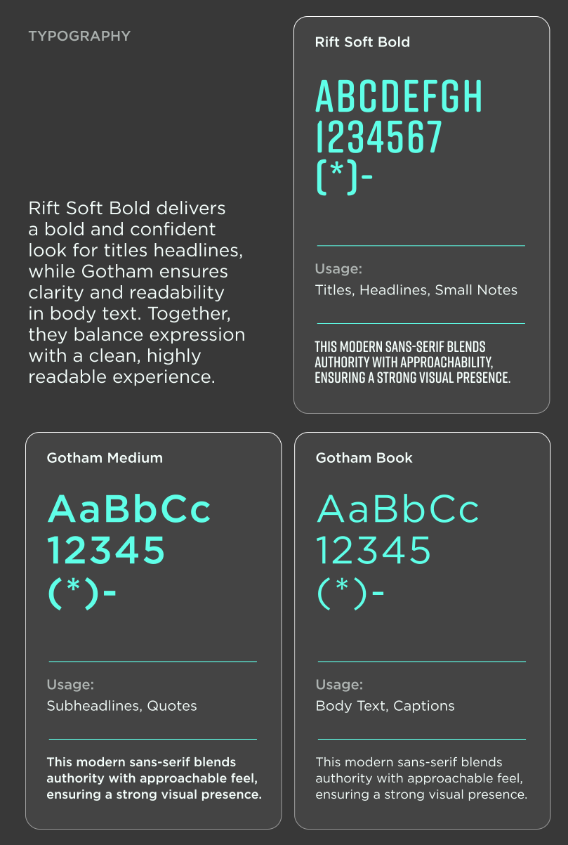
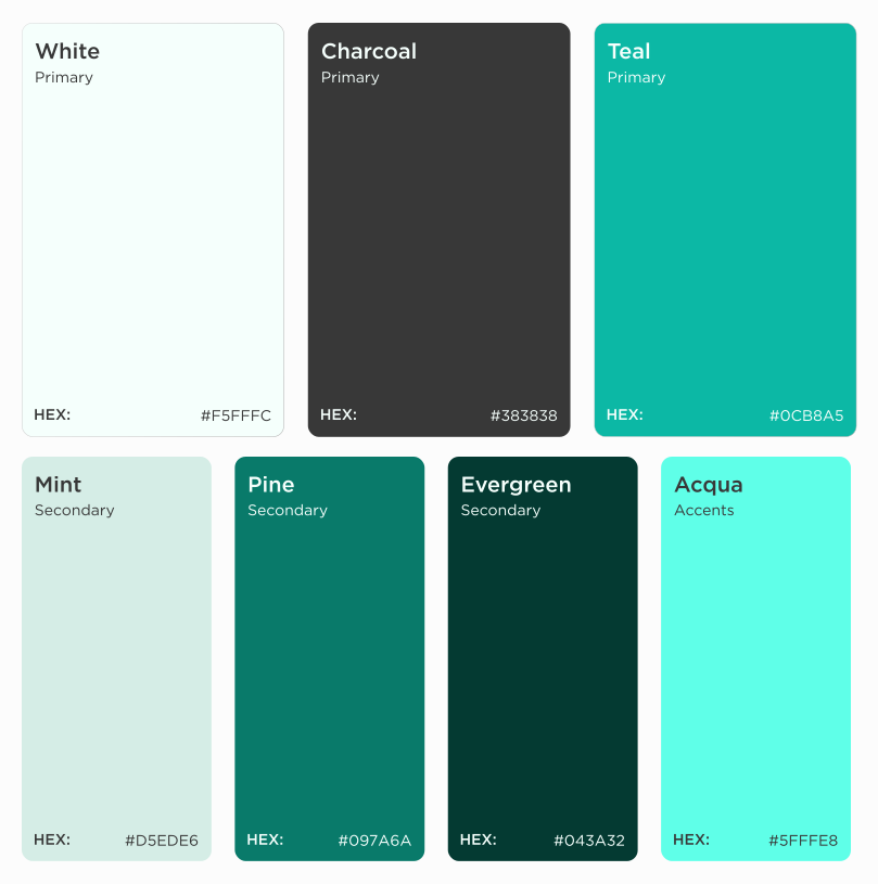
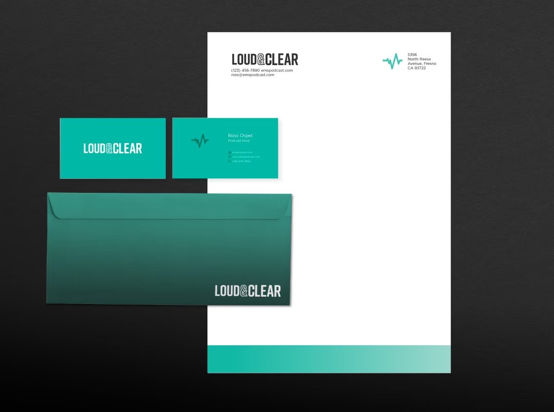
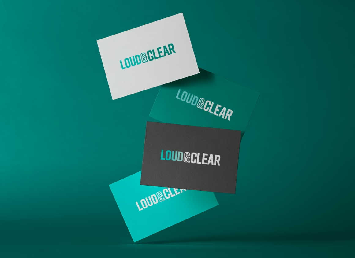
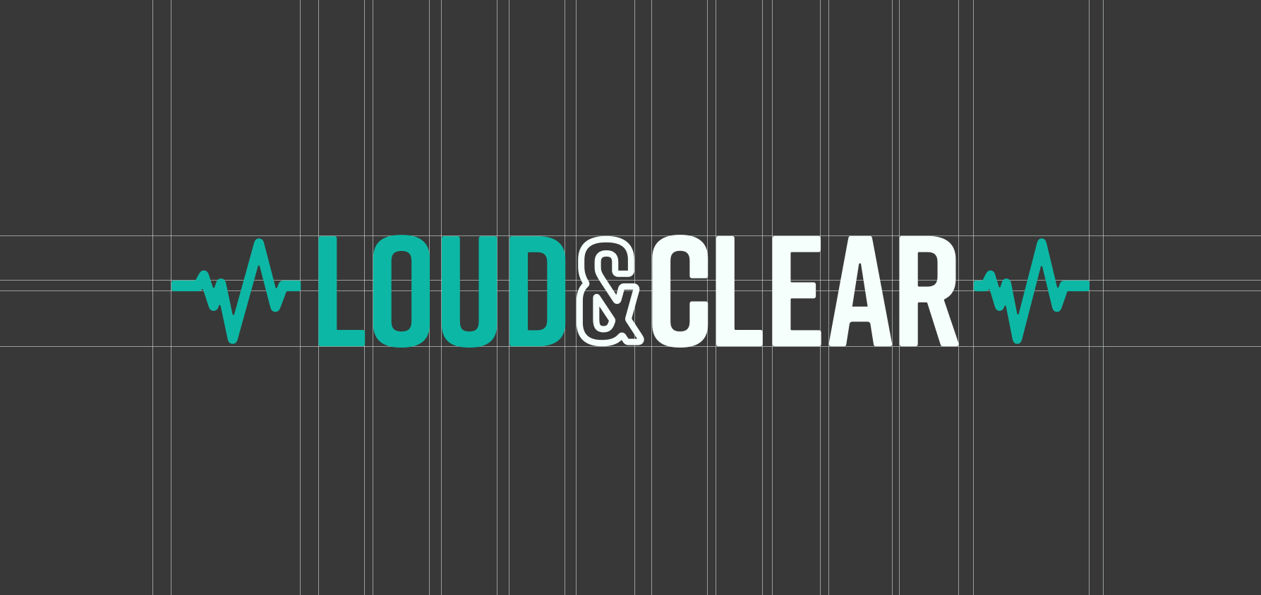
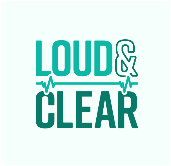
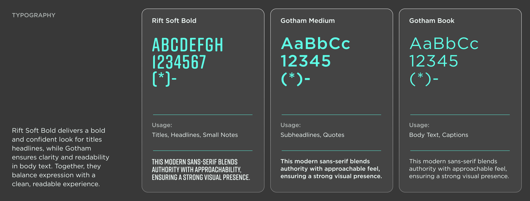
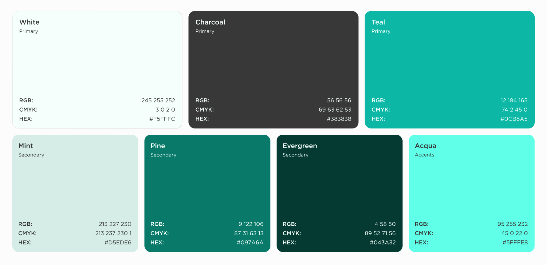
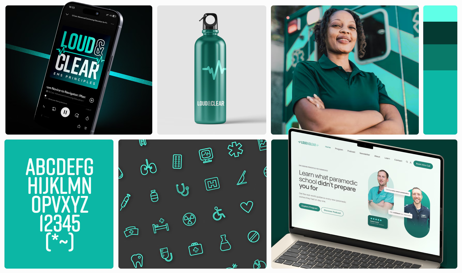
A distinctive teal-led palette, bold typography, and restrained use of medical references created a visual language that feels modern, professional, and highly legible.

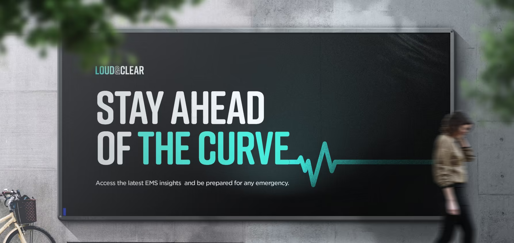
Instead of relying on sirens, ambulance lights, and emergency imagery, the brand communicates expertise through clarity, confidence, and simplicity.

Website

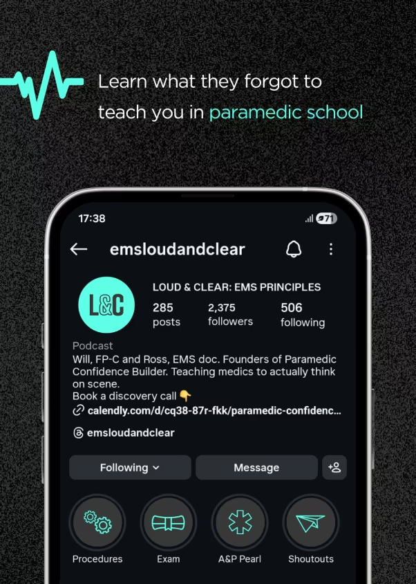
As Loud & Clear expanded beyond podcasting into a paid educational programme, the website needed to become a platform for growth.

I redesigned the information architecture, user experience, and visual design to support programme enrolment, sponsorship opportunities, and newsletter growth.

Episodes were reorganised into searchable categories, and a custom WordPress solution using Advanced Custom Fields (ACF) provided a scalable system for publishing and managing content as the platform continued to evolve.

Outcome

The rebrand repositioned Loud & Clear from a generic EMS podcast into a distinctive educational platform built around clarity, confidence, and professional development.

By moving away from predictable industry conventions, the brand achieved stronger differentiation while maintaining credibility within the EMS space. The new identity and website created a scalable foundation for future content, programme launches, and audience growth.

Challenge

As Ross Orpet and Will Berry renamed their podcast from EMS Cast to Loud & Clear, they wanted an identity that reflected the quality of the education they were delivering. While the existing artwork clearly signalled EMS, it felt dated and visually interchangeable with countless other podcasts in the category.

The challenge wasn't recognition—it was differentiation. How could the brand remain credible to paramedics while creating a more distinctive and memorable position within the industry?

Discovery

A review of competing EMS podcasts revealed a category dominated by the same visual language: red and blue palettes, ambulance lights, lifeline graphics, and clinical aesthetics. While these cues made the category instantly recognisable, they offered little differentiation.

At the same time, Loud & Clear served experienced professionals seeking practical knowledge and continuous improvement, creating a clear mismatch between the sophistication of the content and the way it was being presented.

Strategy

Discovery workshops and competitor analysis revealed an opportunity to move beyond conventional EMS branding. Rather than leaning further into medical symbolism, the brand could own a space centred around clarity, confidence, and professional growth.

The goal became creating an educational platform that felt calm, authoritative, and supportive — helping professionals navigate high-pressure environments while continuously improving their skills.

Brand

The identity system was designed to stand apart from category conventions without losing relevance to its audience.

A distinctive teal-led palette, bold typography, and restrained use of medical references created a visual language that feels modern, professional, and highly legible.

Instead of relying on sirens, ambulance lights, and emergency imagery, the brand communicates expertise through clarity, confidence, and simplicity.

Website

As Loud & Clear expanded beyond podcasting into a paid educational programme, the website needed to become a platform for growth.

I redesigned the information architecture, user experience, and visual design to support programme enrolment, sponsorship opportunities, and newsletter growth.

Episodes were reorganised into searchable categories, and a custom WordPress solution using Advanced Custom Fields (ACF) provided a scalable system for publishing and managing content as the platform continued to evolve.

Outcome

The rebrand repositioned Loud & Clear from a generic EMS podcast into a distinctive educational platform built around clarity, confidence, and professional development.

By moving away from predictable industry conventions, the brand achieved stronger differentiation while maintaining credibility within the EMS space. The new identity and website created a scalable foundation for future content, programme launches, and audience growth.

“The podcast redesign was a huge hit.”

- Ross Orpet, Founder & Host of Loud & Clear

RELATED WORK
Looking for a designer who can think, design and build?

I connect strategy, visual design and digital execution to turn complex ideas into clear, cohesive brand experiences.